Fook Kuin Medical Centre
- SABAH,
MALAYSIA
- Completion Date
2014 - Client
Fook Kuin Medical Foundation - Cost
$70m - Design Consultant
studio505 - Base building Architect
Surbana
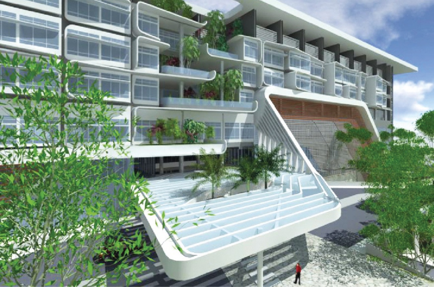
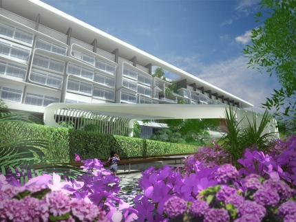
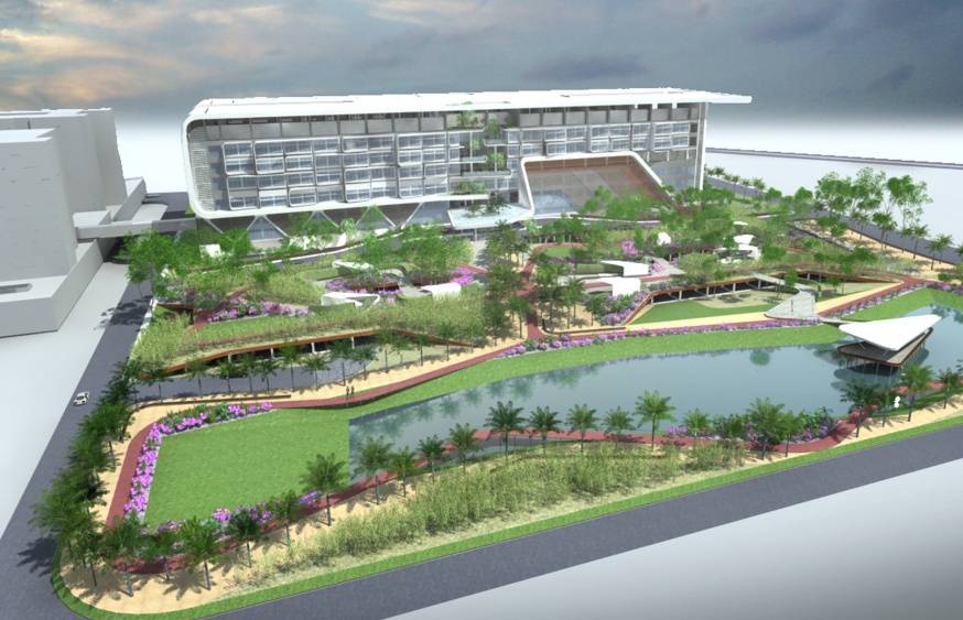
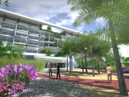
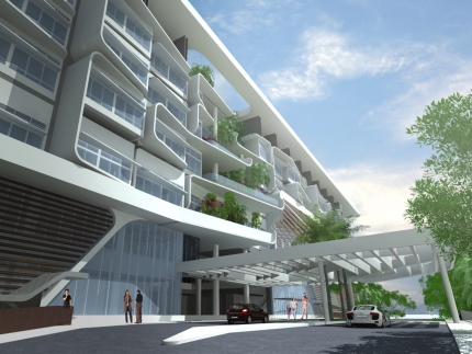
studio505, together with Surbana Corporation and Arkitek TM are working on the architectural design and interior design for a new 300 bed private medical centre in Sabah, Malaysia. The building, whilst compact in its exterior form and appearance, is in plan based on an H-type layout with two vertical, central patient and visitor cores. This configuration, typically housing 4no wards per floor, allows for as many functions as possible to be orientated to the building exterior thus maximising the use of daylight. The entire building is climate controlled to counter the hot humid local environment, except for the two storey high entrance lobbies which are designed as a natural breezeway.
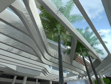
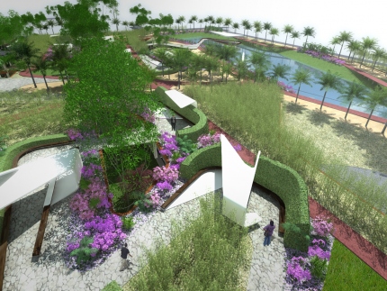
The building’s external identity is created through a large scale white ribbon, incorporating upper roof, external western shading, as well as the two central entrance canopies. The external façade design incorporates extensive western and overhead shading to reduce solar heat gain and aims to emphasise the importance of individual patients and staff members within the overall organisation. A sophisticated external park, incorporating individual gardens and a running track, is located above the centre’s main car park to incorporate it seamlessly into the surrounding environment. The project is expected to reach completion towards the end of 2015.
505工作室与客户以及基建建筑师Surbana合作,在马来西亚沙巴地区规划了一个极具现代感的建筑设计方案,来呈现创新设计以及创造文化地标性建筑。
利用简单的适合医疗需要的平面布置,同时又保证可以满足当地最严格的医疗设计原则来为病人和工作人员提供最大限度舒适环境。此工程目前正在建设当中。


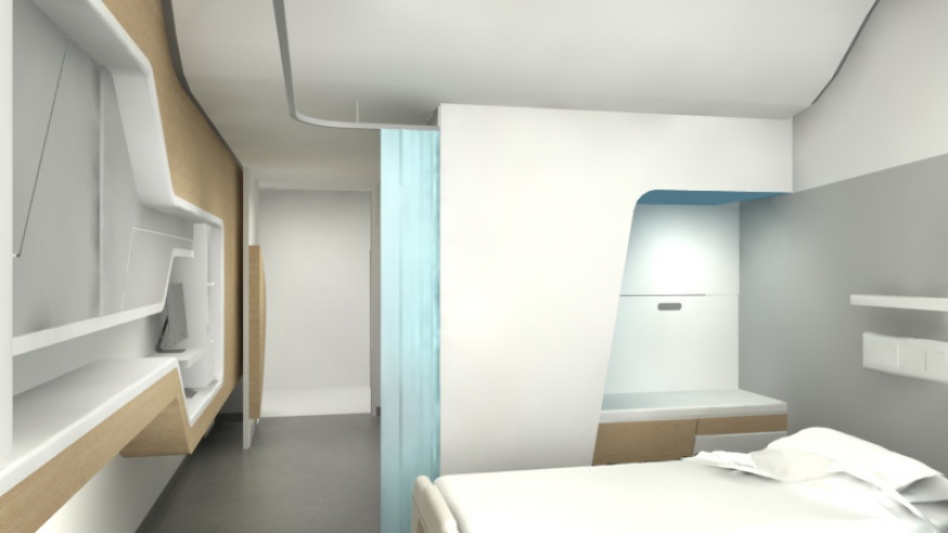
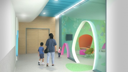
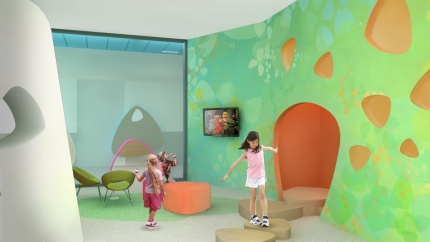
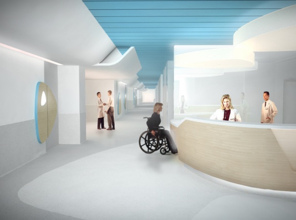
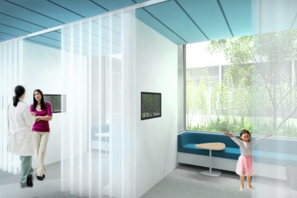
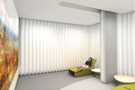
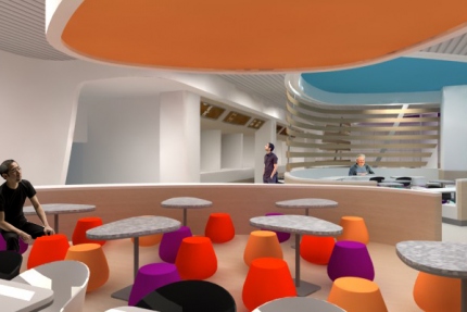
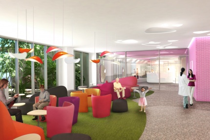
The aspiration for the interior design of FKMC was to create a friendly, non-institutional environment for both patients and staff
.jpg)
Clear and imaginative navigations systems within hospitals are essential and with the use of colour and form motifs, the way-finding at FKMC is clear to navigate and understand. The scheme divides each level into four colour quadrants, guiding and orientating patients and visitors.
The use of nature-inspired motifs, like pebbles and water, blur the boundaries between the inside and the outside of the building and create a large scale interior ‘zen garden’.
Similar to a river which distributes its pebbles according to the ebb and flow of its negotiation with the landscape, studio505 have placed clusters of larger pebbles to signify the areas where people congregate, whilst strategic placement of single pebbles or sinuous ribbons of pebbles direct the flow of people to these areas.
The distribution of pebbles on the floors, walls and ceilings create a clear, imaginative navigation system that is at 'one' with the interior design. The motif creates a sense of well-being by softening the conventional, austere conventions of hospital interiors.
.jpg)
